Typographic Hierarchy Event Schedule Poster
Demonstrating typographic hierarchy and graphic expression through an organized event schedule.
Project Type: Poster Design
Project Duration: October 2025
Role: Solo Designer
Overview
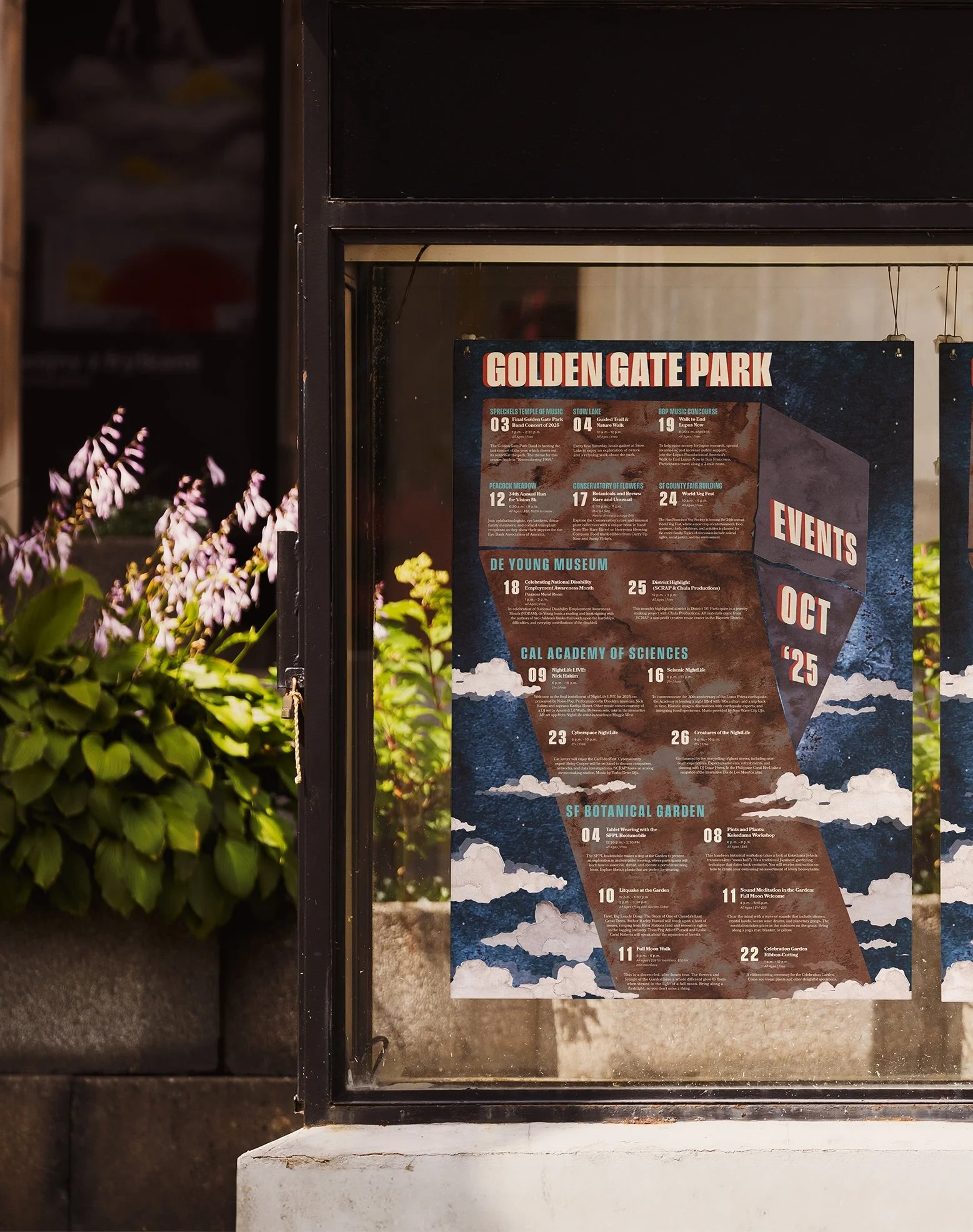
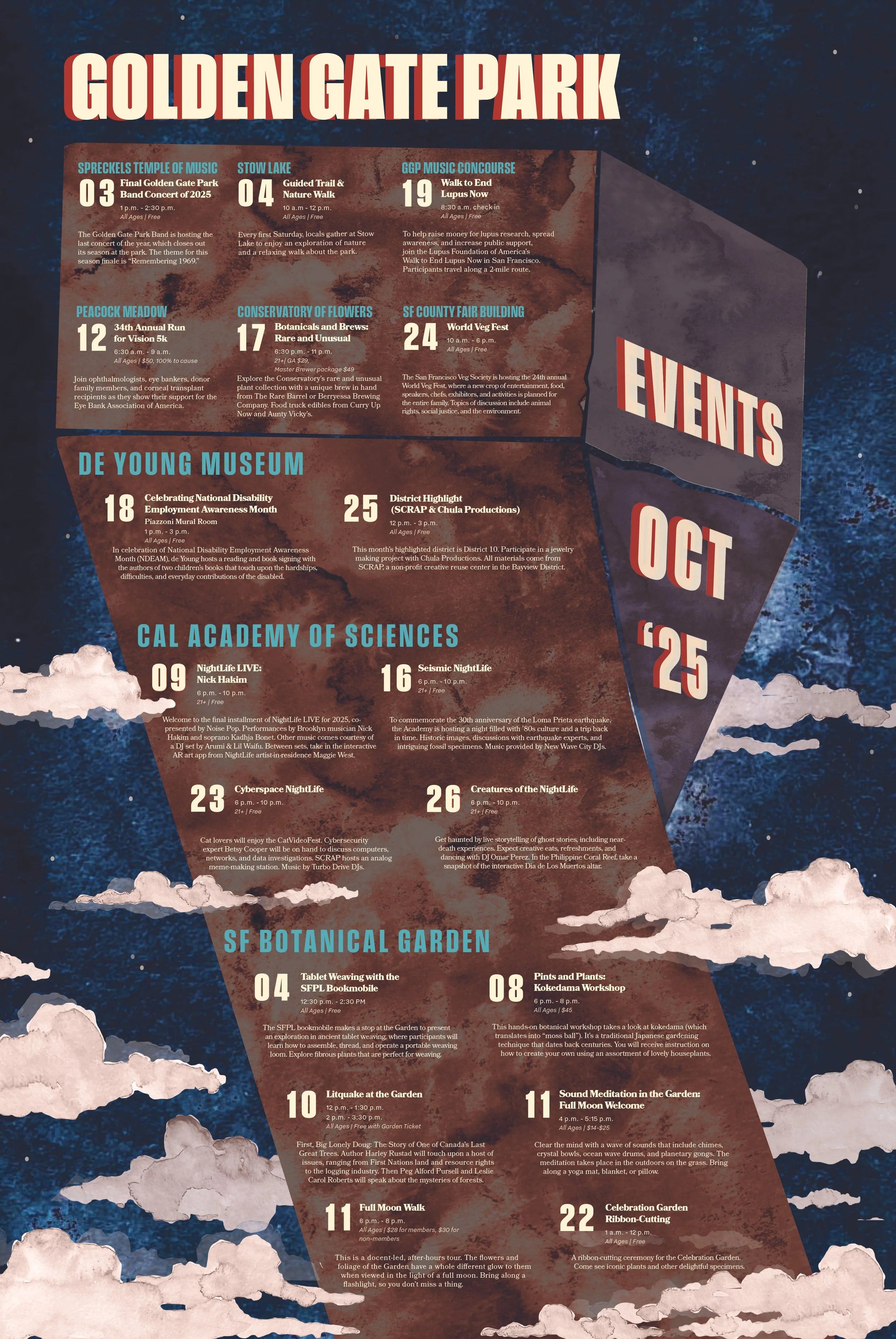
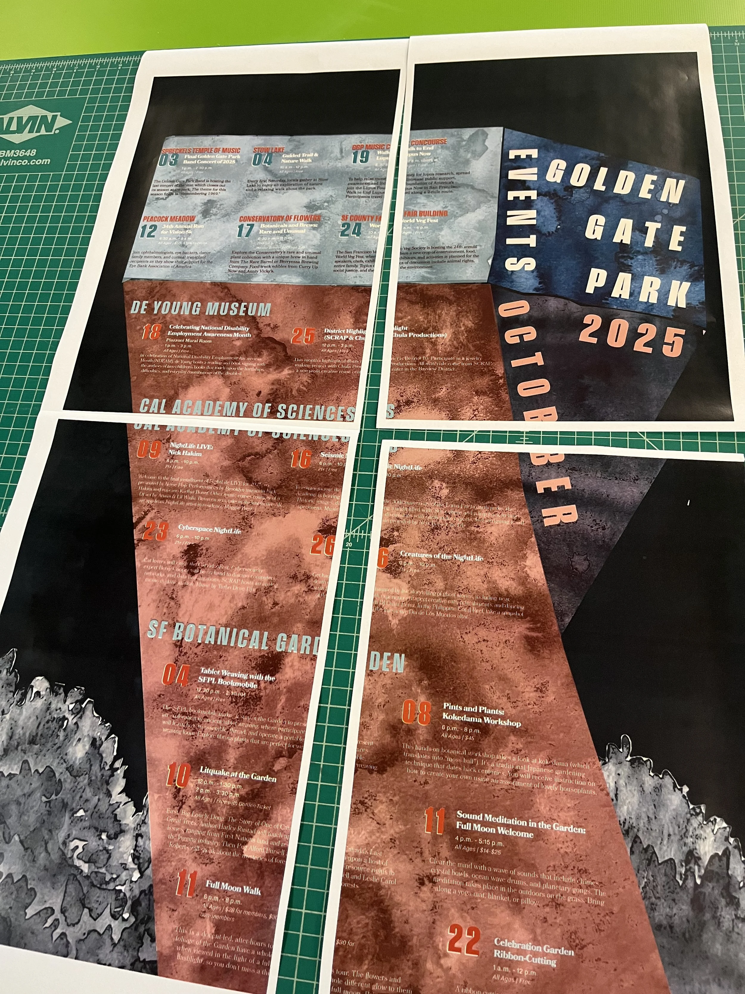
In this project, I created an event schedule poster, organized with extreme attention to typographic hierarchy paired with graphic expression. This poster found inspiration in the architecture of the de Young Museum, located in Golden Gate Park and information was categorized by the location of each event taking place.
The Approach
To begin, the raw text provided was sorted through to consistently format dates, times, titles and locations, as well as editing any typos and repetitive information.
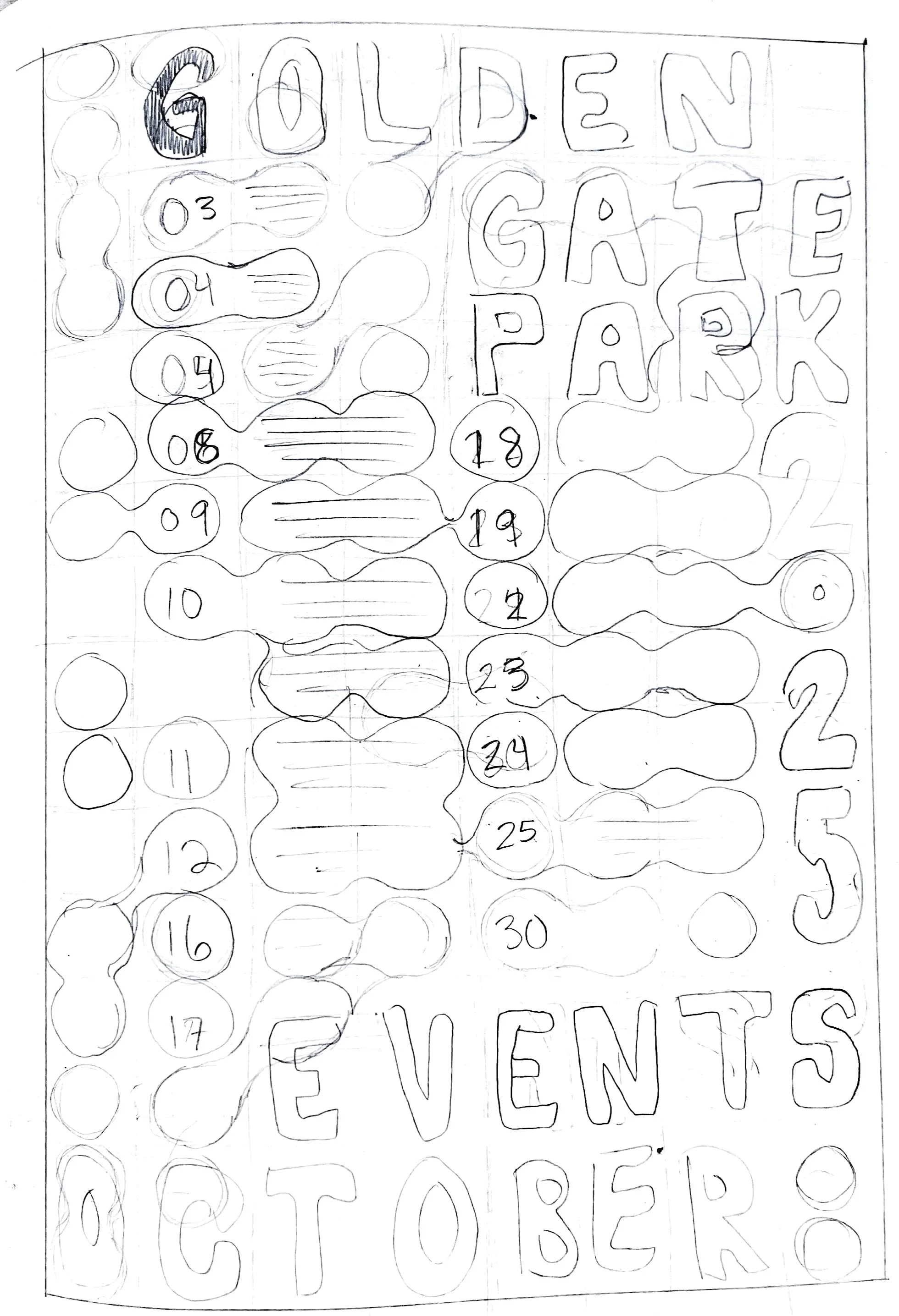
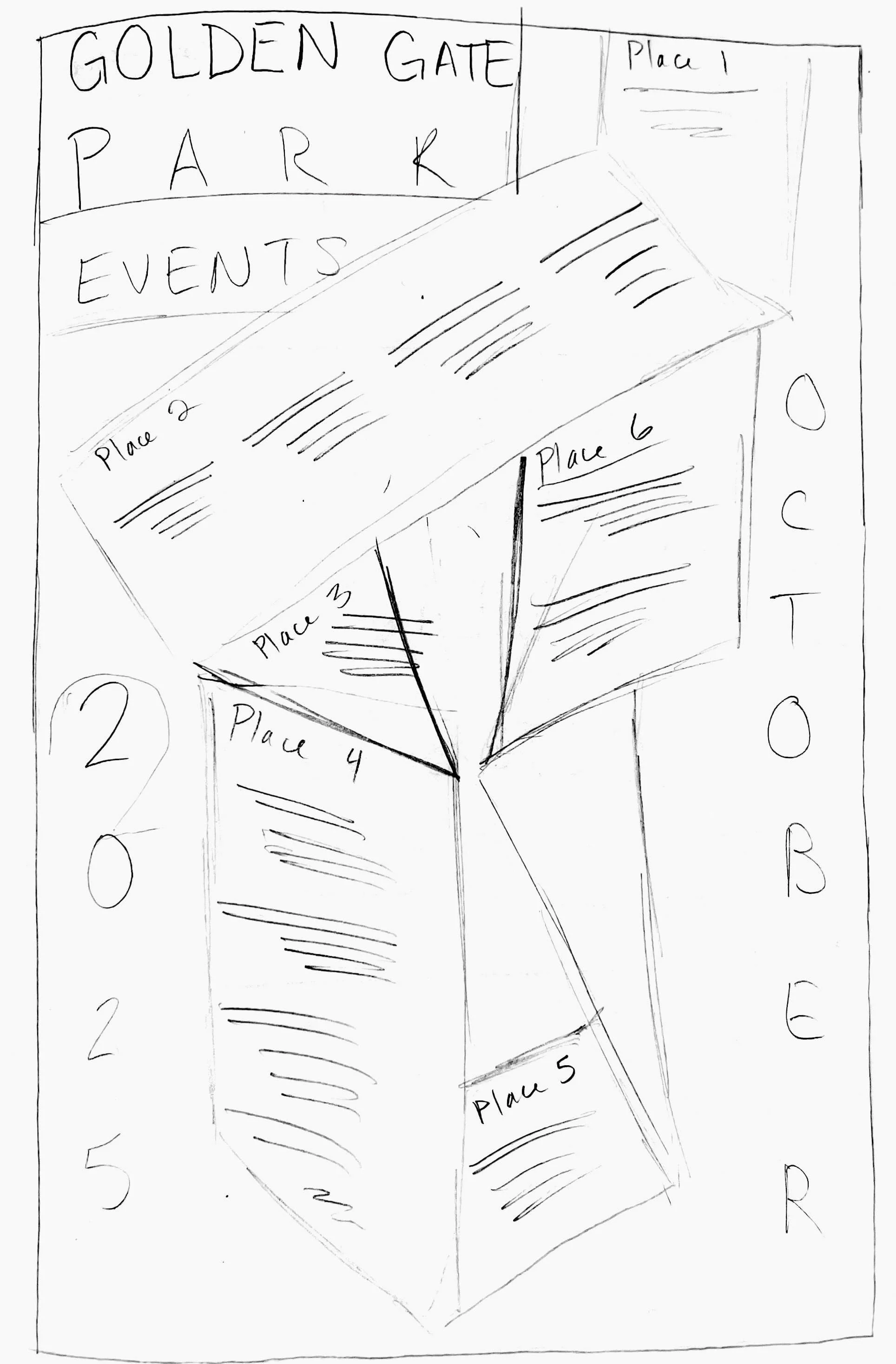
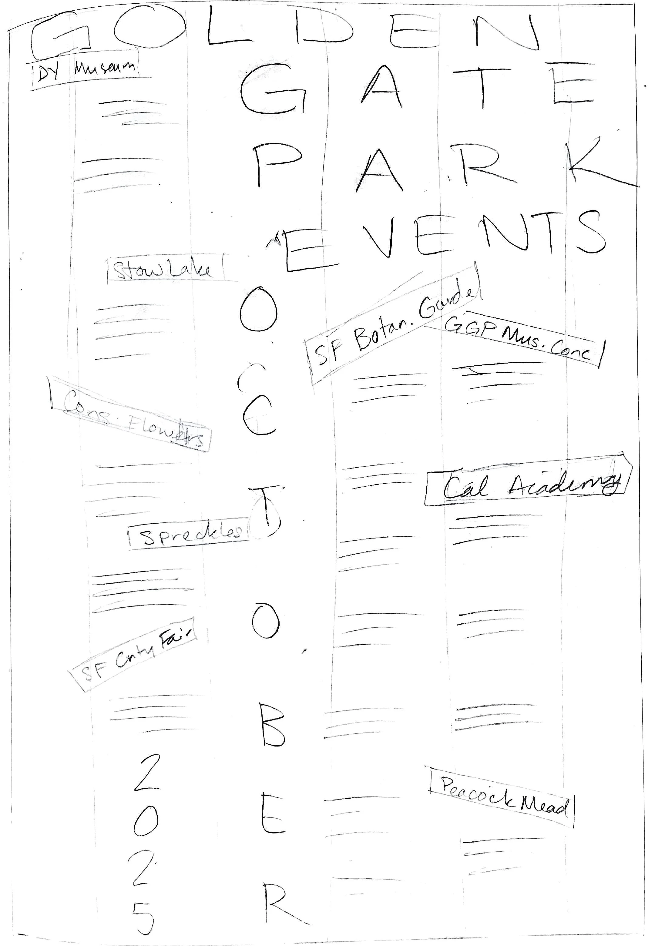
Pencil was then put to paper, creating numerous rough sketches of poster layouts. In the end, we decided to move forward with a structural layout inspired by the architecture of the de Young, one of the key locations mentioned in the poster.
The text was brought into InDesign and layed out on a 12 by 16 grid and organized at 10 pt type. This limitation allowed me to focus on creating hierarchy strictly through layout.
Initial Sketches
The Approach
Many rounds of peer critique and type revision highlighted issues in legibility, the conveyance of the de Young Tower and legibility.
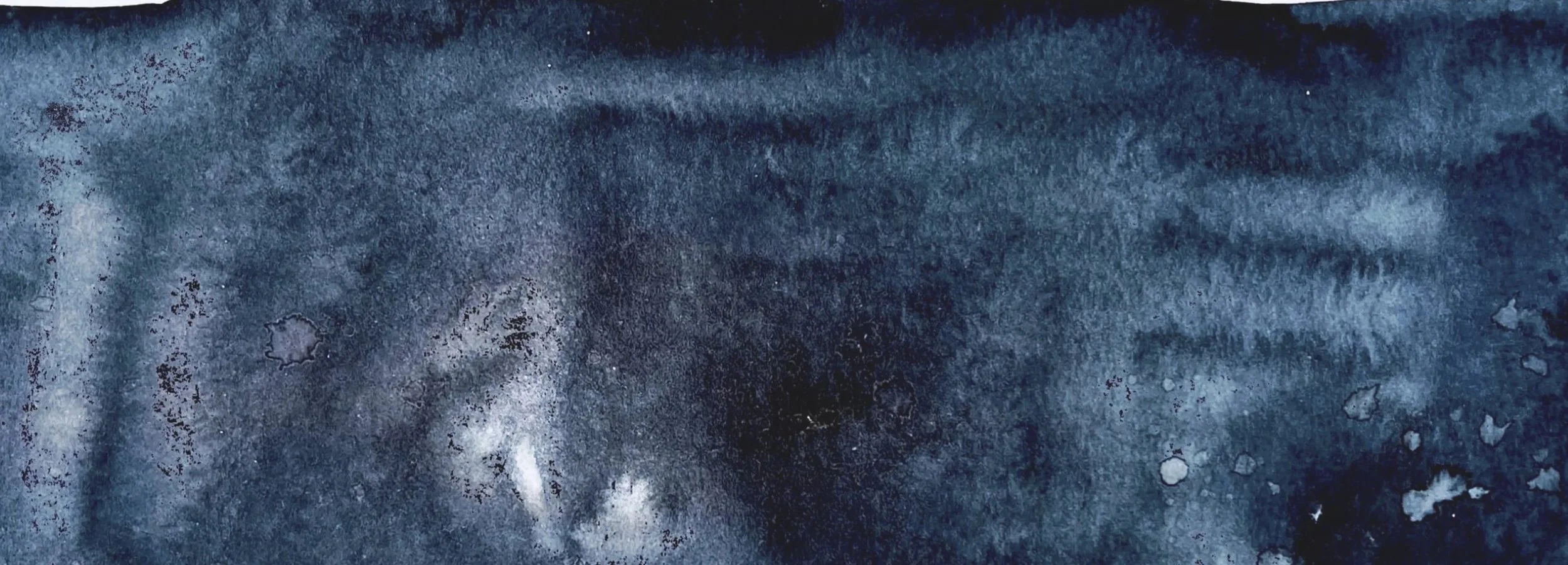
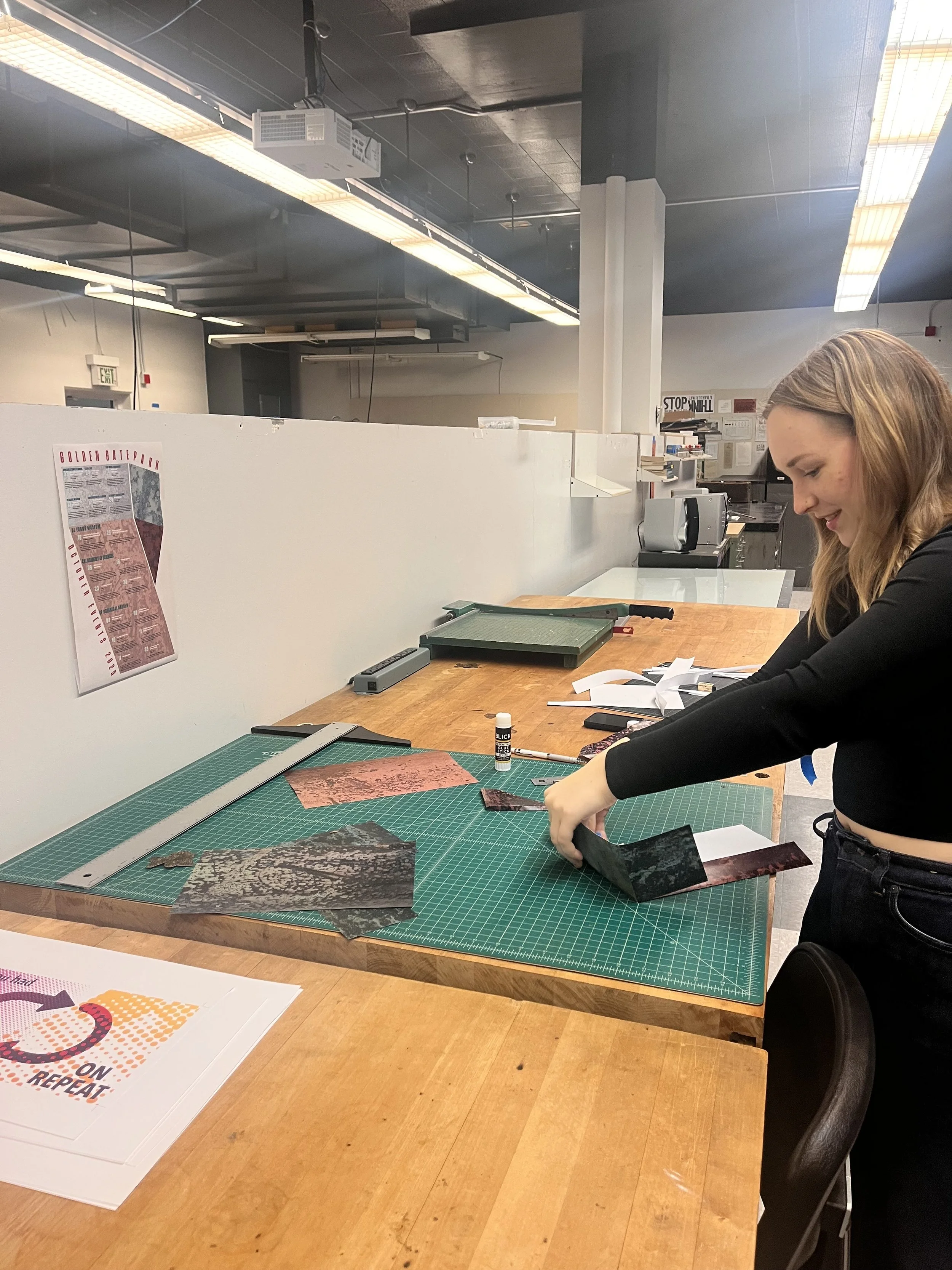
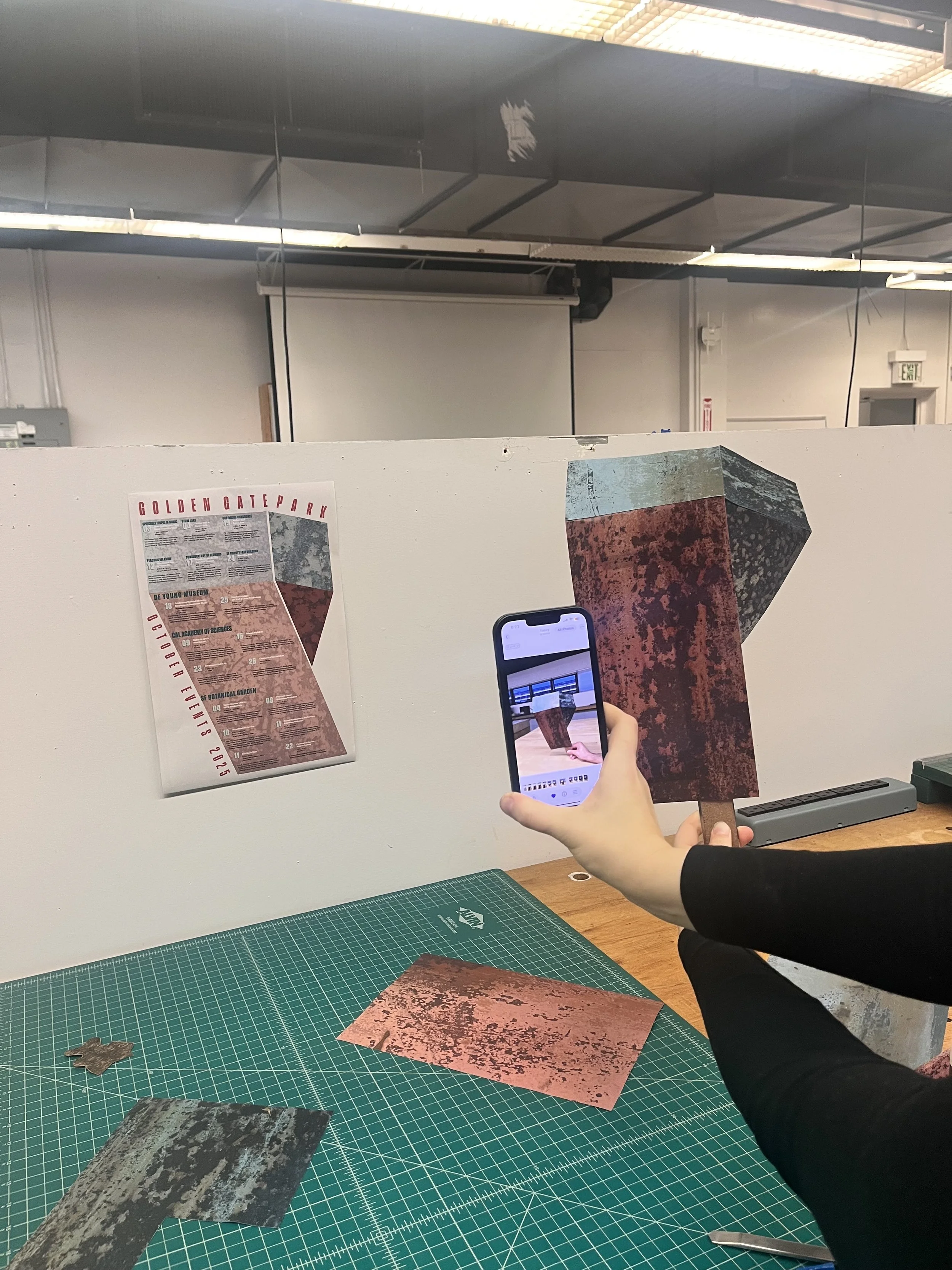
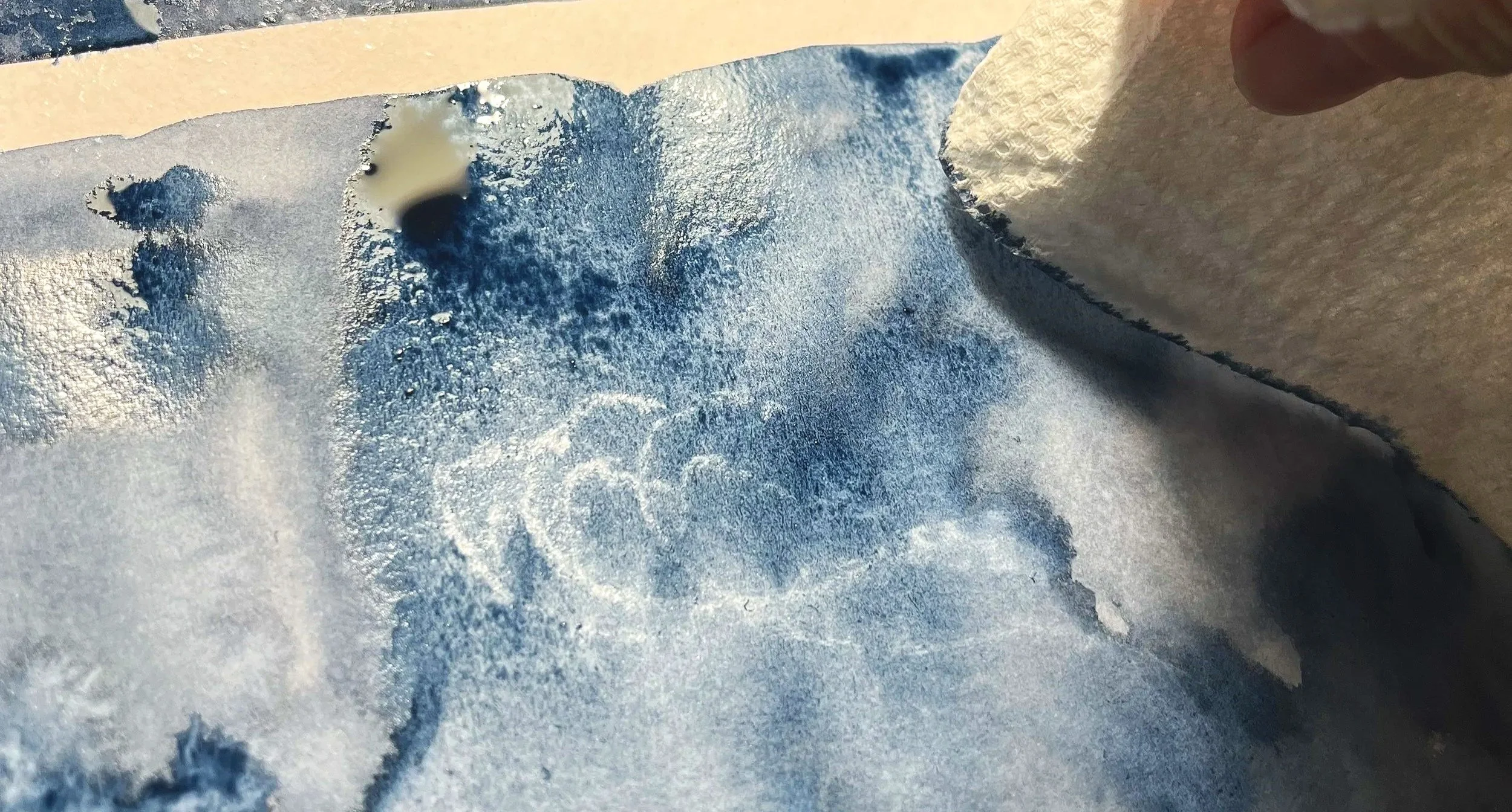
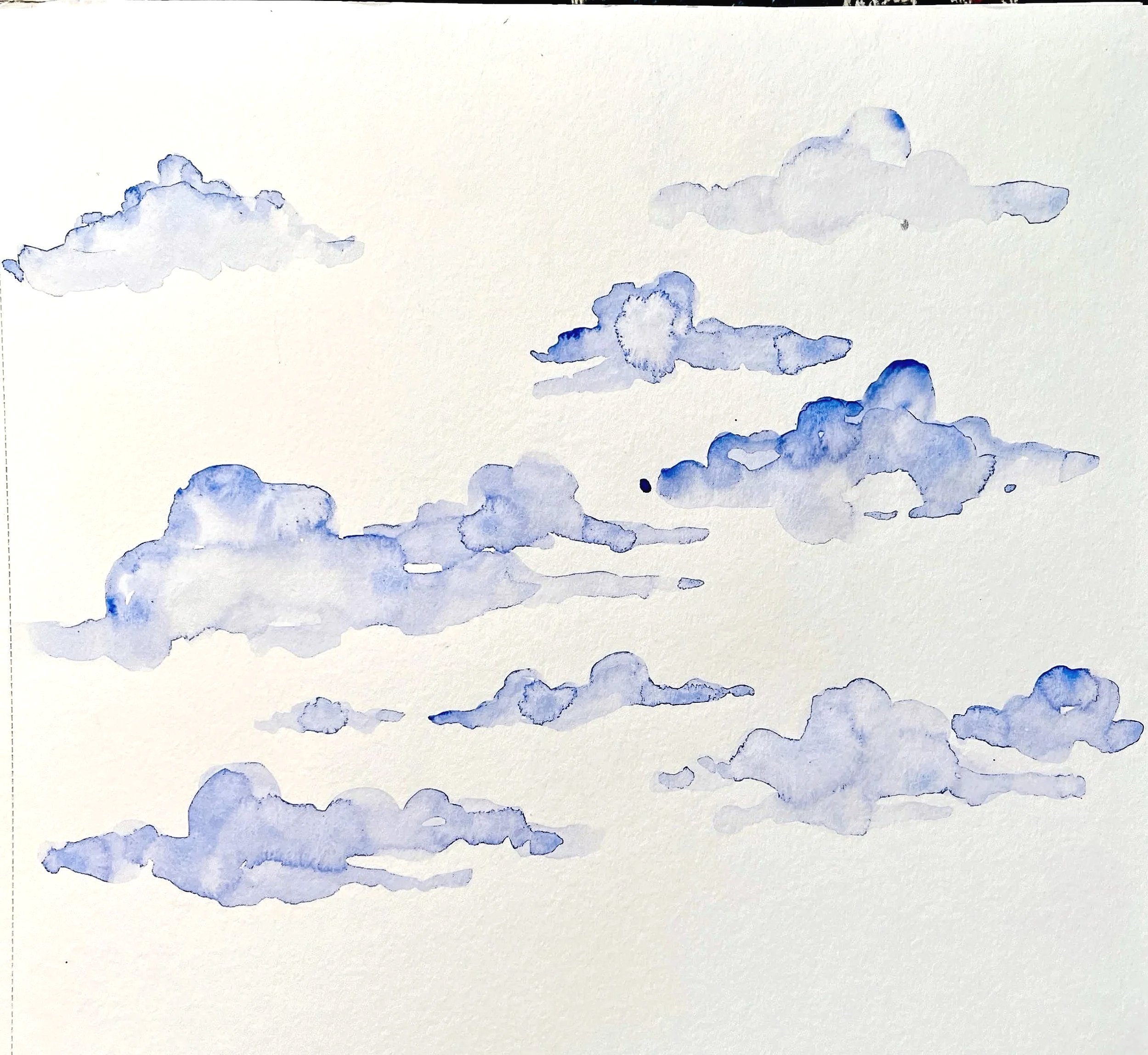
Once my typefaces were finally selected, I began to incorporate graphic expression. I created watercolor washes to stand in as the rusted metal texture for the structure of the tower as well as to fill the background and create a night sky.
From there, well over 20 semifinal iterations were created before the last peer and instructor critique, exploring organization, title treatment, and a sense of depth with the tower.
Findings
For information organization to be effective in design, an effective type hierarchy needs to be established.
Incorporating physical graphic expression with design can really elevate a piece of work, making it feel created by a human and stand out from the crowd of vector-drawn posters.
When organizing large quantities of information on a single page, as was the case here, attention to spacing, point size, and alignment are extremely important, both to fit all the necessary information and to create consistency.
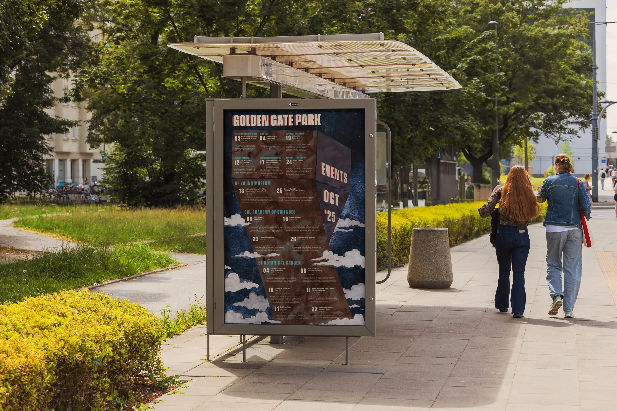
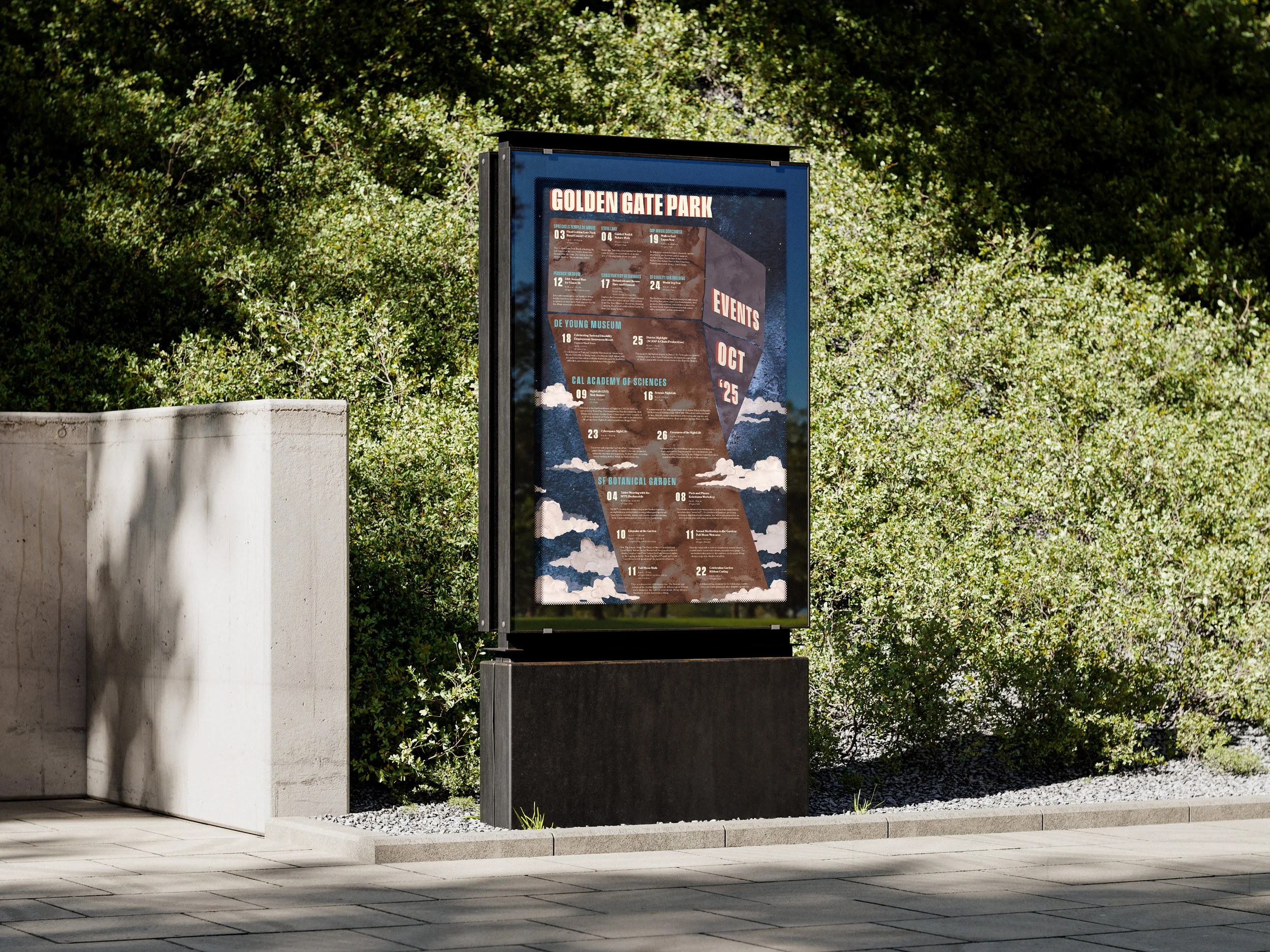
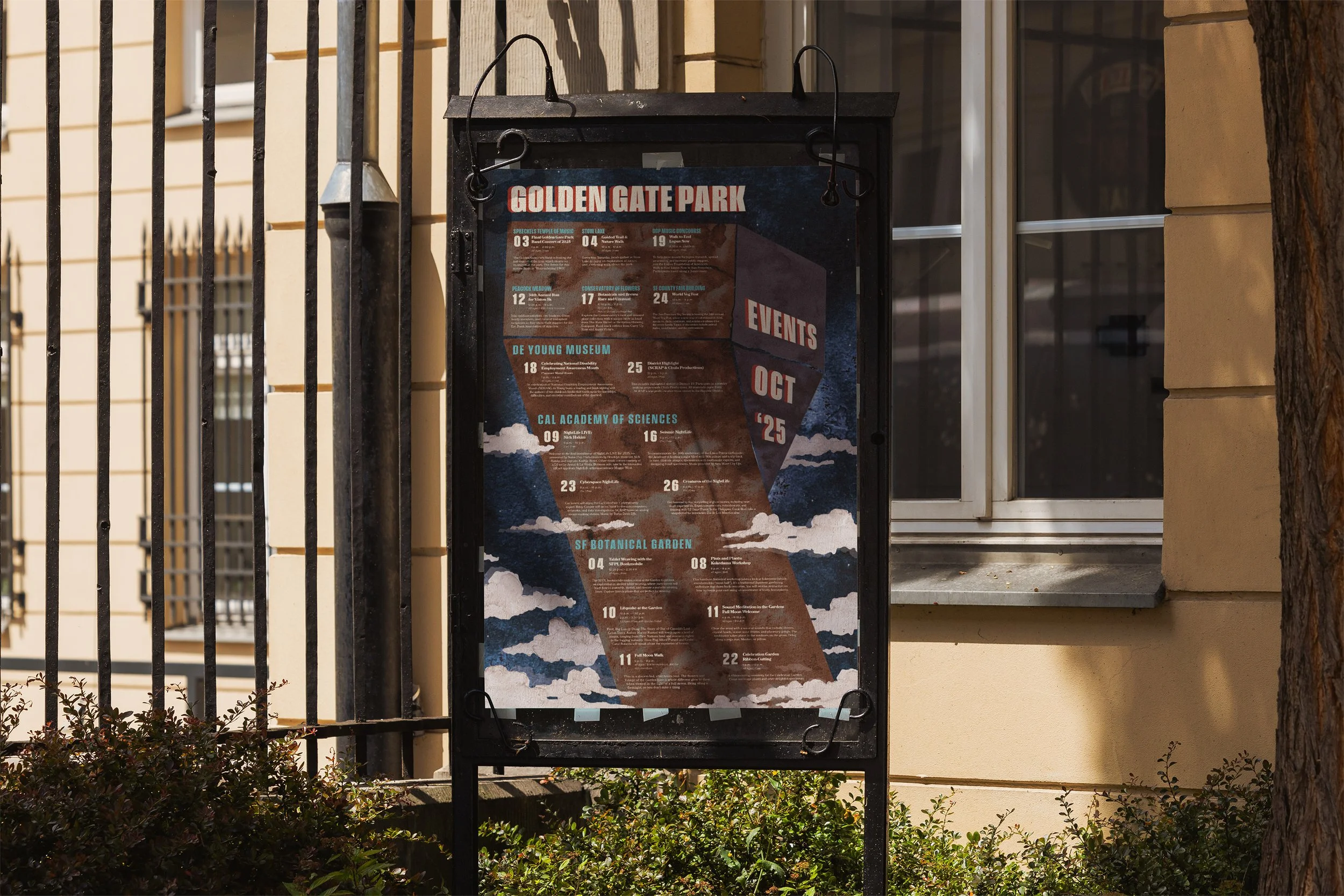
Design Solution
To meet the challenge of designing an attention-grabbing poster for an event series in Golden Gate Park, our team found a guiding source of inspiration found in some of the park’s architecture. This both structured the design and created a unique focal point that stands apart from the hundreds of posters you’re exposed to on a daily basis. Finally, the contrasting warm and cool color palette creates a distinct mood for the poster and catches the eye of passersby without fail.